Hi I’m Higashi.
This page introduces how to bulk make multiple graphs that is aligned with the specified number of rows and columns as shown below.
Just fix two variable, you can change the graph’s number of rows and columns like below.
What you need to do is just prepare the data for graph.
Introduction of Sample Data
In order to introduce the method of creating graphs, there must be data for graphs.
So, I prepare the sample data like below.
import numpy as np
import matplotlib.pyplot as plt
import math
#making data for graph
x=np.linspace(0,360,361)
y1=np.sin(2*math.pi/360*x)
y2=np.sin(2*math.pi/360*x*2)
y3=np.sin(2*math.pi/360*x*3)
y4=np.sin(2*math.pi/360*x*4)
y5=2*np.sin(2*math.pi/360*x)
y6=3*np.sin(2*math.pi/360*x)
y7=4*np.sin(2*math.pi/360*x)
y8=5*np.sin(2*math.pi/360*x)
These data is same shown beginning of the article.
By conduct this code, you can get 8 data that is housed in y1~y8 variables.
The graph introduced later is set the horizontal axis is ‘x’, vertical axis is ‘y1~y8’.
Making Data List for Graph
As a preparation for graph creation, you should make a list housed the data like below code.
y_list=[y1,y2,y3,y4,y5,y6,y7,y8]The contents of the list are consistent with the data created above paragraph.
Making Label and Title List for Graph
The program introduced later can set the data label and graph title respectively.
So, you should need these name list.
I made it like below.
⇒Please edit the content appropriately.
label_list=['y1','y2','y3','y4','y5','y6','y7','y8']
title_list=['Y1','Y2','Y3','Y4','Y5','Y6','Y7','Y8']
Preparations are complete.
Sample Code of Arranging Multiple Graphs
Then, by using the list prepared in advance, let’s make graph actually.
The program is below.
#graph number of rows and columns
grf_row=2
grf_col=4
#making graph
fig = plt.figure(figsize = (grf_col*4,grf_row*4))
ax_list=[]
for j in range(grf_row):
    for i in range(grf_col):
        if (j*grf_col+i)<len(y_list):
            ax_list.append(fig.add_subplot(grf_row, grf_col, j*grf_col+i+1))
            ax_list[j*grf_col+i].plot(x, y_list[j*grf_col+i], color='blue', label=label_list[j*grf_col+i])
            #set a graph label
            ax_list[j*grf_col+i].set_xlabel('X',fontsize=14)
            ax_list[j*grf_col+i].set_ylabel('Y',fontsize=14)
            #set a legend and title
            ax_list[j*grf_col+i].legend(loc ='upper right',fontsize=14)
            ax_list[j*grf_col+i].set_title(label_list[j*grf_col+i],fontsize=14)
            #set max and min value
            ax_list[j*grf_col+i].set_xlim(0,360)
            ax_list[j*grf_col+i].set_ylim(-5,5)
#set the graph interval
plt.subplots_adjust(wspace=0.4, hspace=0.6)
plt.savefig('sample1.jpg',dpi=300)
plt.show()
2nd line and 3rd line are variable of graph’s rows and columns.
⇒Please change appropliately.
19 line and 20 line are are also you should change.
(max and min value setting of graph axis.)
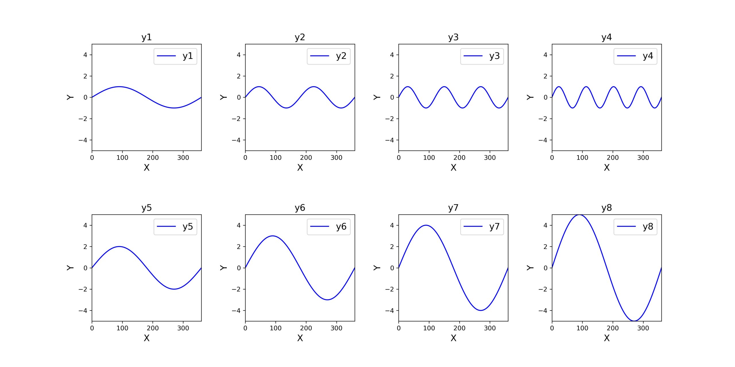
Demonstration of Sample Code
Finally, let me conduct the sample code introduced above.
At first, the setting is below.
grf_row=2
grf_col=4
The output is like this.
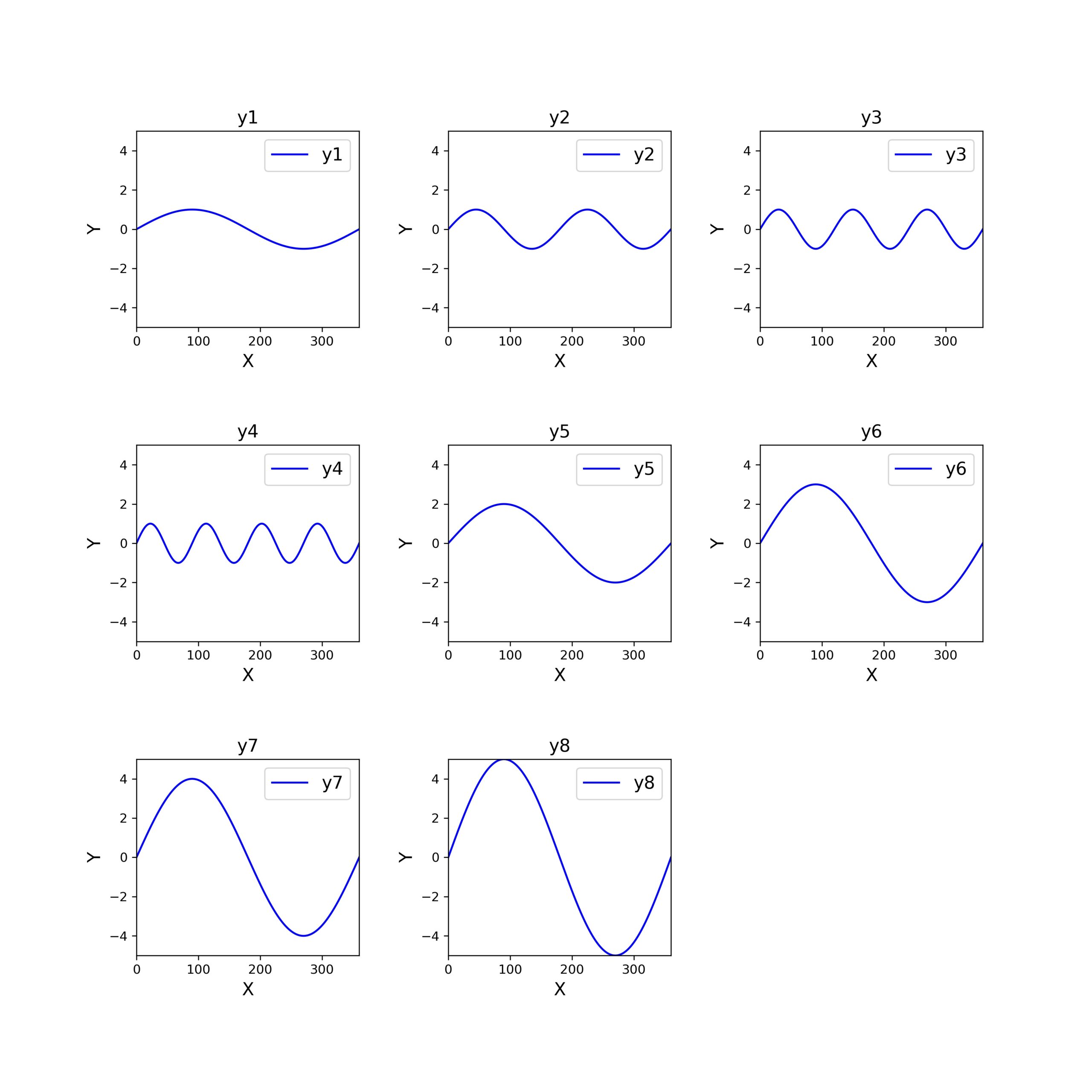
Next, the setting is below.
grf_row=3
grf_col=3
The output is like this.
Insufficient parts are output with blanks like above.
This is very convenient!!
That’s all. Thank you!!


コメント